


Hello guys here you can get my all youtube projects source code totally free.
please keep supporting me. Like share and subscribe.
HTML CODE :
<!DOCTYPE html>
<html>
<head>
<meta charset="utf-8">
<meta name="viewport" content="width=device-width, initial-scale=1">
<title>Restro landing page design using only html and css in hindi</title>
<link rel="stylesheet" type="text/css" href="style.css">
<link rel="stylesheet" href="https://cdnjs.cloudflare.com/ajax/libs/font-awesome/4.7.0/css/font-awesome.min.css">
</head>
<body>
<header>
<div class="overlay"></div>
<nav>
<div class="logo">
<i class="fa fa-cutlery" aria-hidden="true"></i> Restro
</div>
<div class="menu">
<a href="#"><i class="fa fa-home" aria-hidden="true"></i> Home</a>
<a href="#"><i class="fa fa-user" aria-hidden="true"></i> About</a>
<a href="#"><i class="fa fa-apple" aria-hidden="true"></i> Food</a>
<a href="#"><i class="fa fa-book" aria-hidden="true"></i> Bookings</a>
<a href="#"><i class="fa fa-briefcase" aria-hidden="true"></i> Services</a>
<a href="#"><i class="fa fa-phone" aria-hidden="true"></i> Contact</a>
</div>
</nav>
<div class="container">
<div class="left">
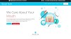
<h1>Enjoy Our <span id="del"> Delicious</span> Meal</h1>
<p>
Tempor erat elitr rebum at clita. Diam dolor diam ipsum sit. Aliqu diam amet diam et eos. Clita erat ipsum et lorem et sit, sed stet lorem sit clita duo justo magna dolore erat amet
</p>
<br>
<a href="#"> Book Table</a>
</div>
<div class="right">
<img src="images/hero.png">
</div>
</div>
</header>
</body>
</html>
CSS CODE:
*{padding: 0; margin: 0; box-sizing: border-box;}
header{
width: 100%;
height: 100vh;
background: url('images/bg-hero.jpg');
background-size: cover;
position: relative;
color: white;
}
.overlay{
width: 100%;
height: 100%;
position: absolute;
top: 0;
left: 0;
background: rgba(0, 0, 0, 0.9);
}
nav{
width: 100%;
height: 100px;
position: absolute;
z-index: 2;
display: flex;
justify-content: space-around;
align-items: center;
}
.logo{
font-size: 2.5em;
color: orange;
}
.menu a{
text-decoration: none;
color: white;
padding: 10px 20px;
margin: 0 5px;
font-size: 16px;
}
.menu a:first-child{
color: orange;
border-top: 1px solid orange;
border-radius: 8px;
}
.menu a:last-child{
color: orange;
border-top: 1px solid orange;
border-radius: 8px;
}
.menu i{
font-size: 25px;
padding: 0 2px;
}
.container{
width: 100%;
height: 100%;
display: flex;
justify-content: space-around;
align-items: center;
position: absolute;
z-index: 2;
}
.left{
flex-basis: 45%;
}
.right{
flex-basis: 35%;
}
.right img{
width: 100%;
animation: 10s anim linear infinite;
}
.left h1{
font-size: 5em;
}
#del{
color: orange;
}
.left p{
margin: 15px 0;
line-height: 1.9rem;
}
.left a{
text-decoration: none;
color: white;
background: orange;
padding: 10px 20px;
border-radius: 50% 0 50% 0;
}
@keyframes anim{
0%{
transform: rotate(0deg);
}
100%{
transform: rotate(360deg);
}
}
Download Source code : click here
your's loving Nilesh Dadheech


0 Comments